MINERVA'S MAGICAL TOY SHOP
Minerva specializes in magic and collectors toys,
and helping customers locate hard-to-find items.
Project Goals
The challenge for this two-week solo concept project:
Design a
website that retains a distinctive
community feel, while expanding into e-commerce.
community feel, while expanding into e-commerce.
Key Research Takeaways
Competitive Landscape
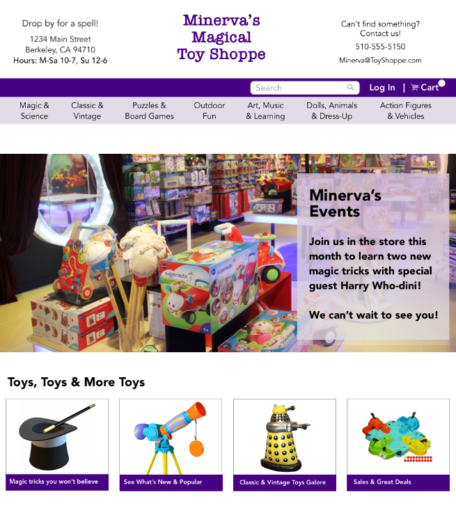
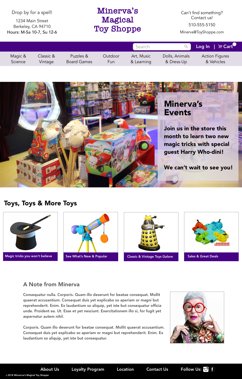
Minerva is never going to be competitive against the big online retailers. Where she can shine is by highlighting her special toys, events, and service. Supporting these differentiators are key drivers in the design solution.
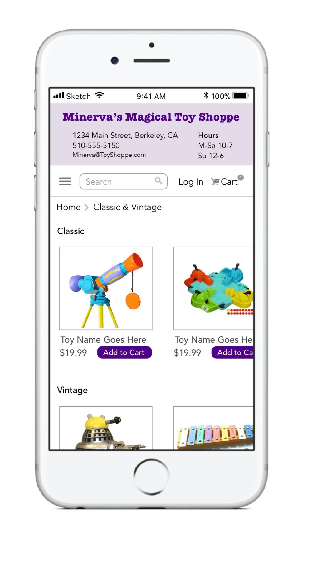
Information Architecture
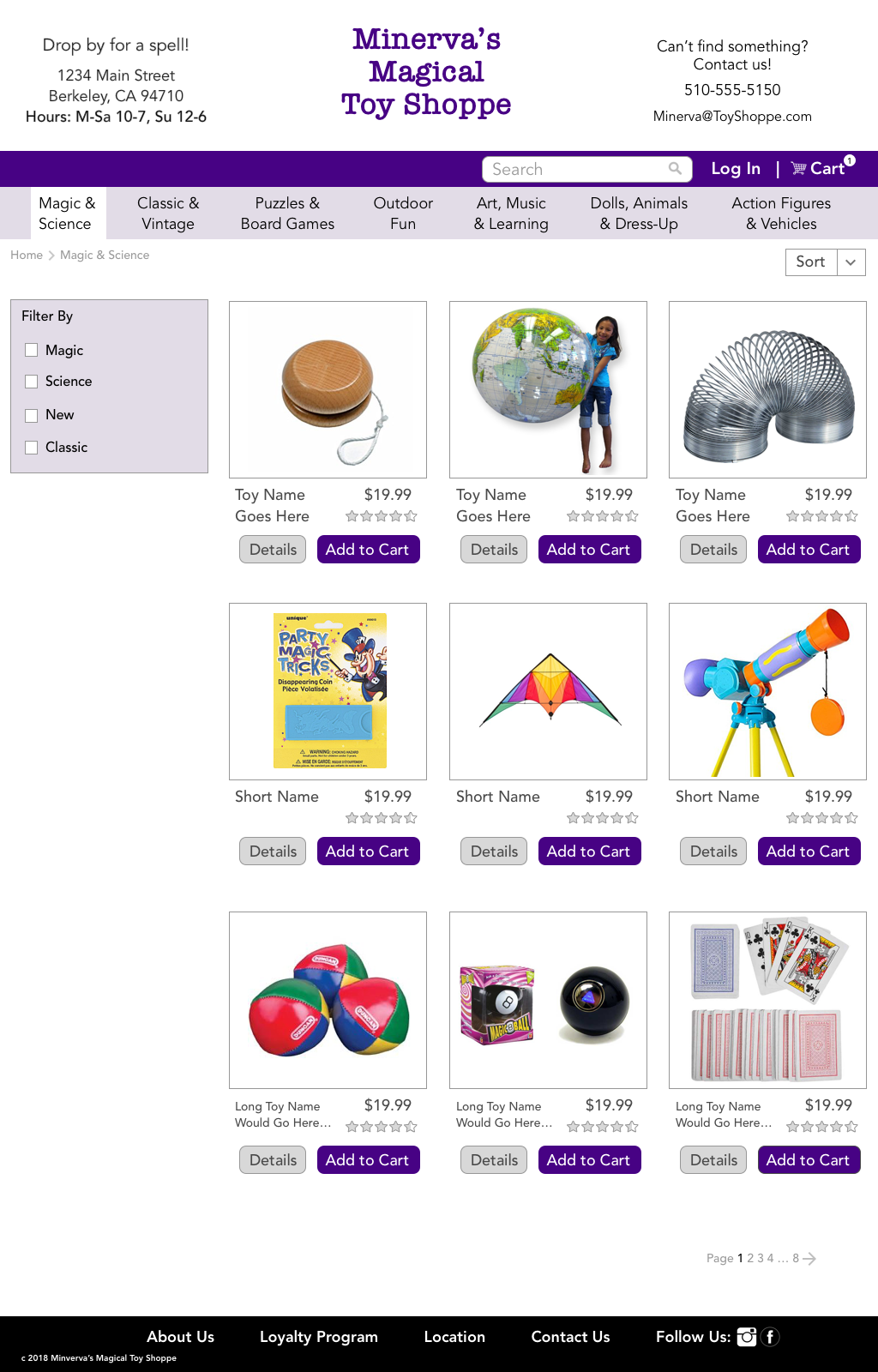
Using card sorts, I established hierarchy to inform easy site navigation. Ensuring clear navigation is important for both e-commerce, and to retain the magical shopping experience of the store.
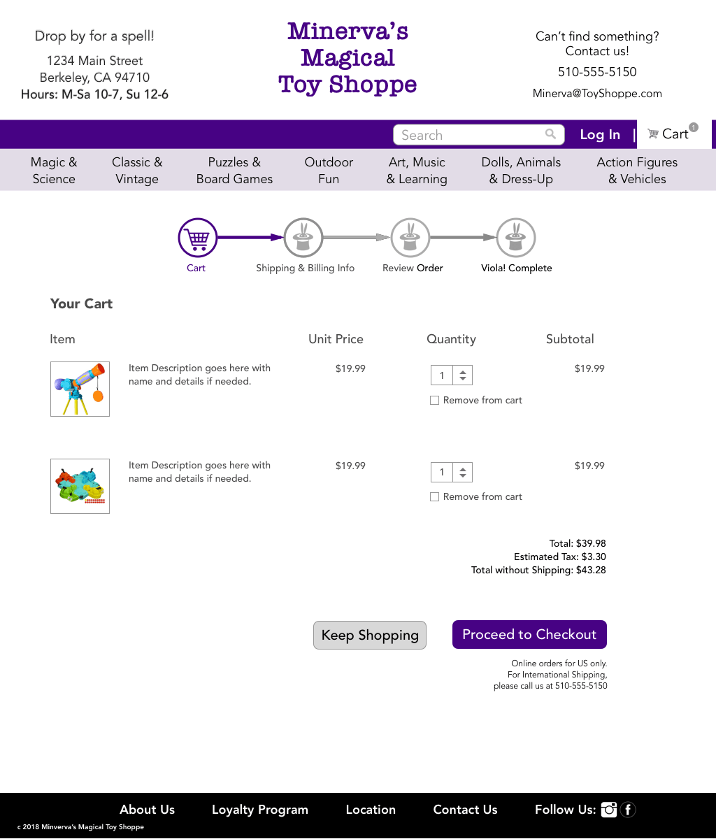
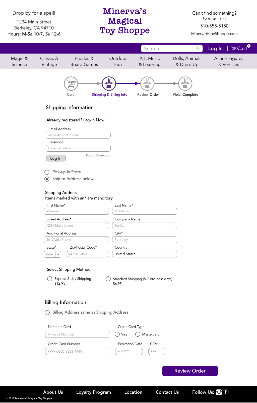
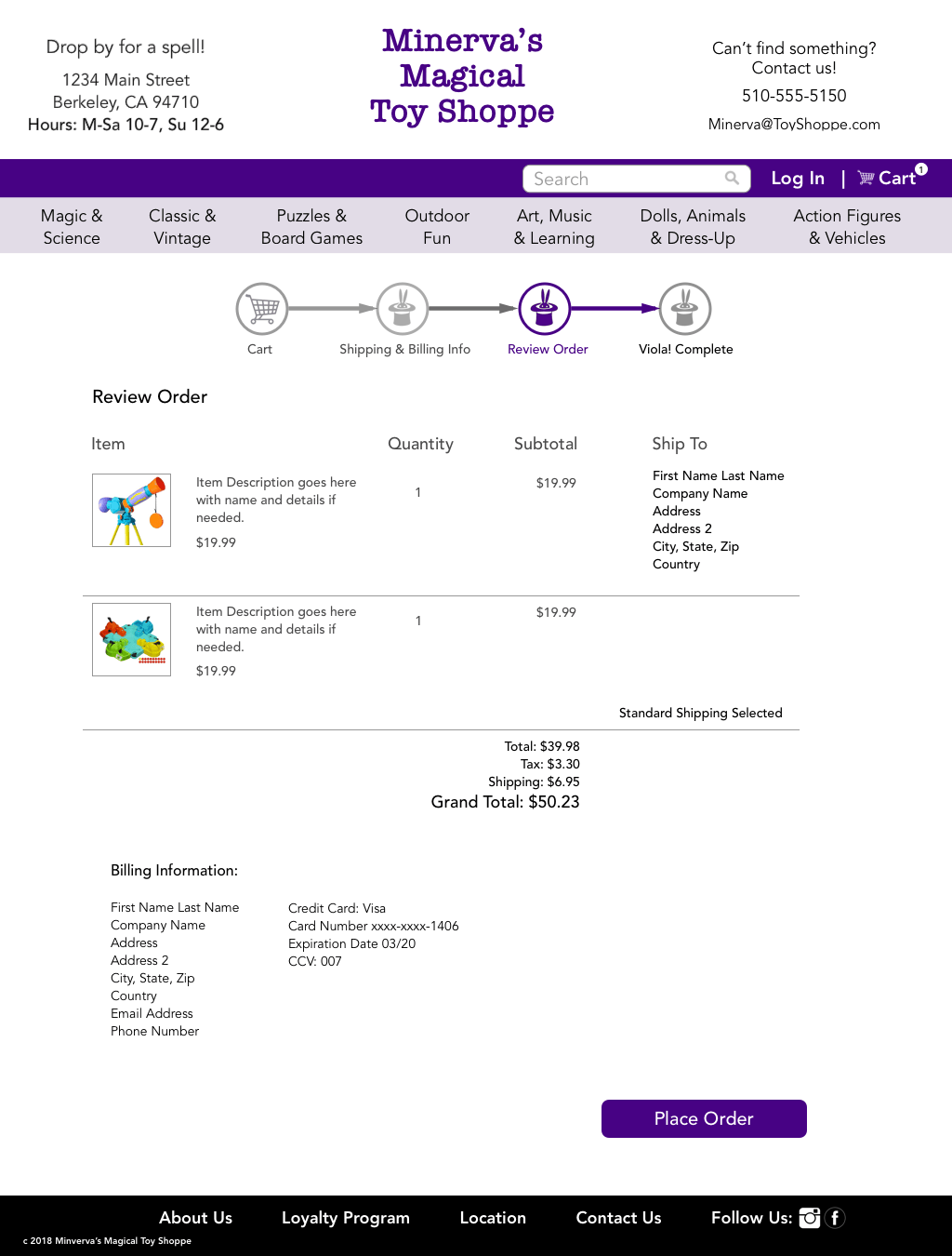
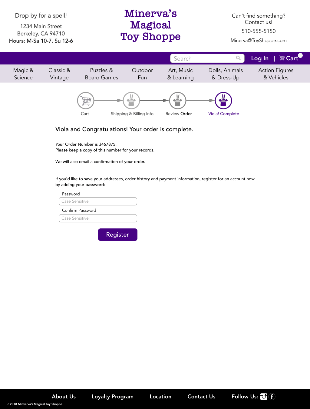
Check-out Flow
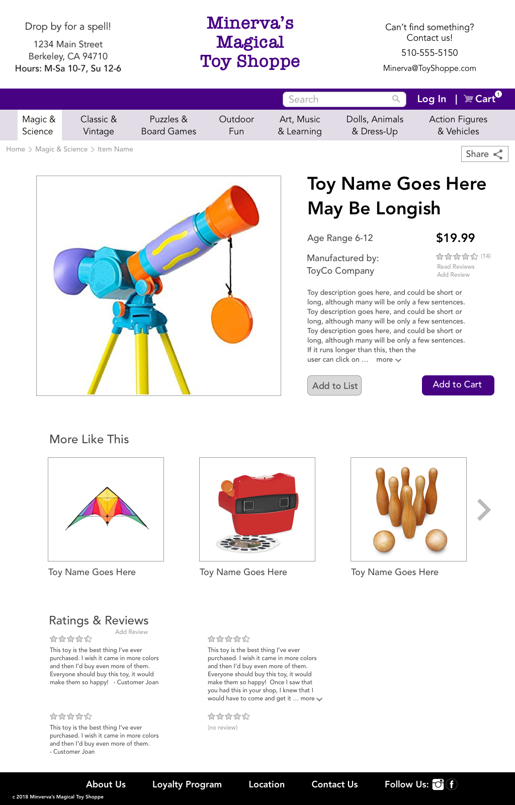
Simplify, simplify, simplify (I guess I should just say that once?) From user testing and with references to well established check-out patterns, I streamlined the process to support conversion. Inclusion of a whimsical progress bar and in-store pick-up option highlight the business’ values.
Supporting a Variety of Shoppers
Using personas to create scenarios

Jenny
Jenny is a 52 year old HR manager. Her 9-year-old Grandson loves magic. She wants reassurance that she’s choosing an appropriate gift for him, without duplicating what she got last year.

Jason
Jason is a 38 year old school teacher who likes creative, well-made toys. His 12-year-old daughter’s birthday is coming up. He's looking to purchase a specific gift that he already has in mind.

Daniel
Daniel is a 29 year old TV scriptwriter. He collects classic toys, and considers himself a savvy connoisseur. He loves what’s new and hot, mobile technology, and reading and writing reviews. He wants to check out quickly.
Designing for different needs
I developed a site map using my personas' needs to make sure all shoppers could easily accomplish their tasks.
Jenny: Login to save past orders, Store contact information
Jason: Quick and easy search option
Daniel: Reviews, Like this recommendations, Mobile responsive
All:
Simple and quick check-out flow
Design Solution
Focusing on the primary user and business objectives:
- Easy to navigate
- Multiple simple paths from browsing to selection
- Checkout flow simple and streamlined
- Personalized, community feel of the business displayed
Check-out Flow